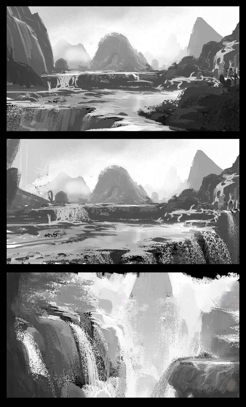
And now for my last paint over from the IDEA Academy workshop, the work of
Tommaso Gomez, a longtime industry vet and a great all around artist, as you can see from his environmental study (and website)
Since Tommaso's painting is technically quite sharp, for this post I'll focus a bit more on composition in service of storytelling-this is an area that even seasoned pros can always work on- myself included. Tommaso's piece shows us a castle high up on a mountain ridge and the there's alot to like in the piece- the division and distribution of light and dark shapes is terrific and the light is working nicely.
At this point I would turn my attention to figuring out what this scene is all about- is this the fortress of some evil ruler? or a peaceful kingdom? or an ancient ruin? To help to find these answers, I want to first do a couple subtle adjustments so that we can lead the eye where we want it to go.
Much of art theory is about leading the viewer's eye through the placement of elements in the scene. One of the simplest compositional guides is known as the Rule of Thirds, in which you divide the canvas into thirds vertically and horizontally, and the areas of interest should be close to the intersections. This is a principle that has been used by classical painters and film makers alike, and it's a good starting point for concept artists as well.
As we can see on Tomasso's scene, the castle is just a bit high and right, which can cause the viewer to linger in other places rather than the focal areas
To address this I'm going to move the castle area slightly. I'm also going to add a secondary area of interest lower on the page ( near the lower left focal area ) to give the eye another opportunity to learn more about this scene. Using the Rule of Thirds is especially useful to convey a sense of balance and stability which is something which seems appropriate to the scene.
In addition to those changes, I'm also lightening the darks of the castle and some other areas to increase the distance and scale- notice we basically have 3-4 levels of distances ( see the previous paintover for more on that ) We could even continue creating a literal path leading the eye from the lower structure to the higher one to guide the eye up.
Now that the elements are framed more prominently, we are free to consider more what the scene is about- for example, if this is a tranquil scene showing a peaceful mountaintop monastery, we can introduce a warm light and some birds to create a nice establishing shot.
As always, the choices I've made here are not necessarily the 'best' ones- ultimately it's up to you to decide to fill in the story, and that will guide your choices. happy painting!


