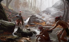
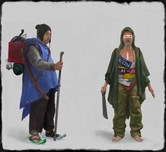
For week we'll be looking at some studies by Lorenzo Tosi
As we can see, Lorenzo has a good feel for light and space in many of these. Notice how the most successful studies have clearly defined spacial groups defined ( fore ground, middle ground and background ) as well as a clear sense of light.
Since Lorenzo has a good grasp of these principles, I'll take this opportunity to talk a bit about staging as another way for you to make your pieces more successful
If we take a look at study A, we see a fairly neutral camera angle- it's not high or low, wide or narrow angle lens. As a result, there's not alot of drama or emotion to this piece. But let's take a look at what would happen if we tweak the camera just a bit
Monday, November 24, 2014
Thursday, November 13, 2014
Paintover #2 : Mirko Failoni
For today's paintover, We'll be looking at the work of Mirko Failoni
Mirko's in class study shows an adventurer in a mountainous landscape.
While the space and tone are reading pretty good, I think we can push things a bit, but more importantly, I want to see if we can push the details a bit to imply a bit more narrative.
More after the page break!
Mirko's in class study shows an adventurer in a mountainous landscape.
While the space and tone are reading pretty good, I think we can push things a bit, but more importantly, I want to see if we can push the details a bit to imply a bit more narrative.
More after the page break!
Tuesday, November 4, 2014
New Paintover
For my students from the IDEA academy in Rome, I'll be doing some paintovers on their final assignments from our workshop- and first up is the talented Annalisa Leoni
Annalisa had concepted a very cool character living in a barren futuristic world, and she started this piece as part of the environmental assignment. I like the mood she's created here, but I think we can push things a bit to make the scene read better, with just a few tweaks
These would be my suggestions to help to establish a more epic feel, as well as to emphasize the graphic look she is leaning towards:
1. The background mountains are all the same height in the composition, and are quite low- I'm going to bring them up and make them a bit uneven to give a better sense of depth and danger. I'm also going to touch up the furthest mountain to push it farther in the distance. Notice that with this light, I will give the mountains some details on the dark side, as well as a bit of direct rim lighting
2. we want to give the sense that the character is really moving into the scene, so I'm going to create some compositional elements to lead the eye in that direction
3. The artist created some really nice lines in the landscape to establish the space- I will simplify and enhance these lines
4. Finally, I will adjust the tones and lighting on the character as well as her shadow to help place her in the scene.
you can see the steps on this GIF
and the final image ( with some simple lighting to give some extra epicness)!
These are all really simple tweaks that any of you can use to help give you works that extra push! Now go out and paint!
Annalisa had concepted a very cool character living in a barren futuristic world, and she started this piece as part of the environmental assignment. I like the mood she's created here, but I think we can push things a bit to make the scene read better, with just a few tweaks
These would be my suggestions to help to establish a more epic feel, as well as to emphasize the graphic look she is leaning towards:
1. The background mountains are all the same height in the composition, and are quite low- I'm going to bring them up and make them a bit uneven to give a better sense of depth and danger. I'm also going to touch up the furthest mountain to push it farther in the distance. Notice that with this light, I will give the mountains some details on the dark side, as well as a bit of direct rim lighting
2. we want to give the sense that the character is really moving into the scene, so I'm going to create some compositional elements to lead the eye in that direction
3. The artist created some really nice lines in the landscape to establish the space- I will simplify and enhance these lines
4. Finally, I will adjust the tones and lighting on the character as well as her shadow to help place her in the scene.
you can see the steps on this GIF
and the final image ( with some simple lighting to give some extra epicness)!
Subscribe to:
Posts (Atom)


