


So for the longest time I've had a single site representing all of the various styles that I work in, and it's worked fairly well for me.
In recent years however, it seems clear that clients have less and less time to spend looking at anything not directly related to what they're looking for. Naturally, they tend to gravitate to artists with singular focused style.
This is nothing new, of course- but due mostly to laziness, I've managed to make due with just a single site up til now. However, thanks to the site tools of Wix.com I've managed to make my own site in a fairly easy fashion, and can now unveil my new portfolio of cinematic works!
http://www.jimmooredesign.com/
More updates to come soon, including a stylized website as well as hopefully a facebook artist page as well...stay tuned!
Wednesday, March 30, 2016
Wednesday, July 1, 2015
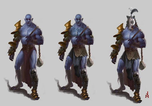
Environmental Design

Monday, March 9, 2015
Monday Paintover: Tommaso Gomez and the rule of thirds

And now for my last paint over from the IDEA Academy workshop, the work of Tommaso Gomez, a longtime industry vet and a great all around artist, as you can see from his environmental study (and website)
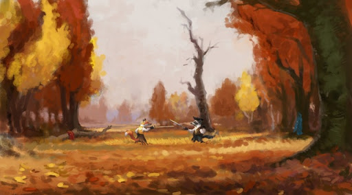
Since Tommaso's painting is technically quite sharp, for this post I'll focus a bit more on composition in service of storytelling-this is an area that even seasoned pros can always work on- myself included. Tommaso's piece shows us a castle high up on a mountain ridge and the there's alot to like in the piece- the division and distribution of light and dark shapes is terrific and the light is working nicely.
At this point I would turn my attention to figuring out what this scene is all about- is this the fortress of some evil ruler? or a peaceful kingdom? or an ancient ruin? To help to find these answers, I want to first do a couple subtle adjustments so that we can lead the eye where we want it to go.
Much of art theory is about leading the viewer's eye through the placement of elements in the scene. One of the simplest compositional guides is known as the Rule of Thirds, in which you divide the canvas into thirds vertically and horizontally, and the areas of interest should be close to the intersections. This is a principle that has been used by classical painters and film makers alike, and it's a good starting point for concept artists as well.


As we can see on Tomasso's scene, the castle is just a bit high and right, which can cause the viewer to linger in other places rather than the focal areas

To address this I'm going to move the castle area slightly. I'm also going to add a secondary area of interest lower on the page ( near the lower left focal area ) to give the eye another opportunity to learn more about this scene. Using the Rule of Thirds is especially useful to convey a sense of balance and stability which is something which seems appropriate to the scene.

In addition to those changes, I'm also lightening the darks of the castle and some other areas to increase the distance and scale- notice we basically have 3-4 levels of distances ( see the previous paintover for more on that ) We could even continue creating a literal path leading the eye from the lower structure to the higher one to guide the eye up.
Now that the elements are framed more prominently, we are free to consider more what the scene is about- for example, if this is a tranquil scene showing a peaceful mountaintop monastery, we can introduce a warm light and some birds to create a nice establishing shot.

As always, the choices I've made here are not necessarily the 'best' ones- ultimately it's up to you to decide to fill in the story, and that will guide your choices. happy painting!
Monday, March 2, 2015
March Paintover: Studies in Grey

Before that I wanted to talk a bit about working in greyscale. When I first starting drawing and painting at the college level, my teachers had us working only in charcoal. This tradition goes back to the earliest art academies, where it was taught ( and still is ) that painting is 90% drawing. The result of working in grayscale is that you develop a strong sense of depth and graphic patterns without the distraction of color. Above is one of my charcoal pieces where I was very much concerned from the beginning with the interplay of light and dark shapes
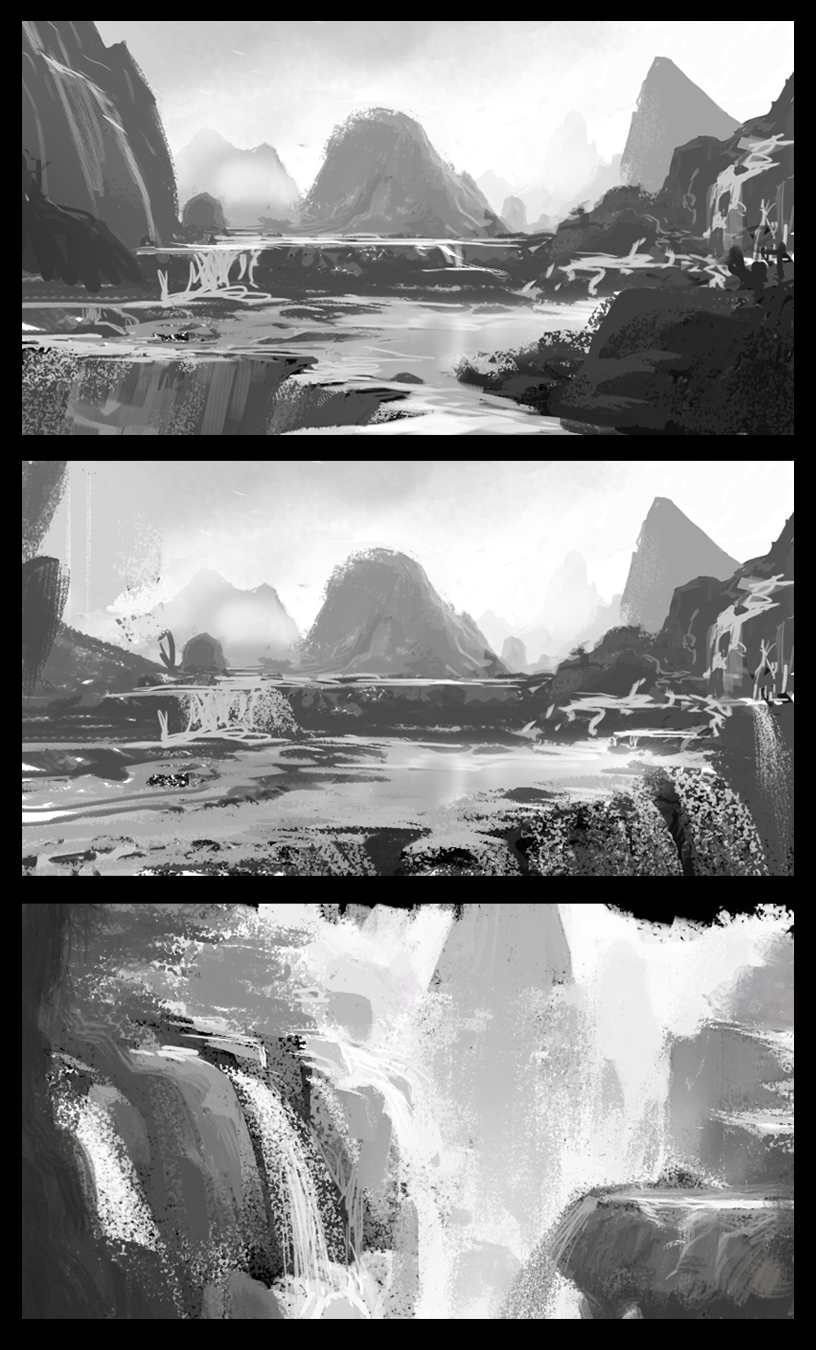
turning now to our next paintover, I see that Stephania 's environmental sketch could benefit from some value adjustment. The first thing to do is simply to turn down the saturation to see how this looks without the color ( note: this is not a 100% accurate way to see your values, but for our purposes it's close enough ).

As you can see, everything is kind of sitting in the middle gray range, so the quickest thing is to simply push the values lighter or darker- and the most basic way to do that is to use atmospheric perspective ( the tendency of objects to have more contrast as they get closer to the eye )

Now, the different shapes are distinct from each other and sit in a space which make some kind of sense. This makes things much easier to 'read' visually, and sets you up to start breaking up the big shapes to take it to the level of render that you have in mind
As always, I recommend starting with big simple shapes ( much of this I'm creating by simply using the selection tool ). Rending beyond this state is simply a matter of breaking the shapes into smaller and more precise shapes. Even the addition of some simple gradients also help to define the space better

So that's it for this lesson- I highly recommend going out and doing some value studies-I may do some myself!
Wednesday, December 31, 2014
Paintover #4: Annalory Sarallo
For our last paintover of 2014, let's take a look at a landscape from Annalory Sarallo

If I recall correctly, Annalory is a bit new to working in digital media, so I'm glad to see her using some cool textured brushes in photoshop, but sometimes these brushes can be a distraction when setting up the fundamentals of your scene. For this reason we'll be taking this image down to simple color fields to make sure everything makes sense, and then we'll build it back up.
In addition to reducing the image to simpler shapes, I'm also doing some color studies to see if we can capture a specific light in the scene. Currently everything is super saturated and could use some tweaking

As you can see, reducing the image to simple shapes allows you to quickly try out color schemes easily. I use photo reference to give me inspiration for different type of daylight set ups. I could do dozens of these light studies to get exactly the look I want, but in this case I'll go with the closest one to her original image.
Once we have that decided, we can go in a make more complex shapes and color grading- for example, the road that goes back into space is more believable when it's bent as it follows the contours of the landscape, and also as it's value and color are softened as it recedes in the distance.

Once this is all in place, we can now go back with our fancy texture brushes and spice up the image- depending on the style you are working in, you may use very little texture, or you may use photomaterial. I'm using a simple hair brush to suggest the texture that was in the original. Always be mindful of going overboard with textures..it's very easy to do! When in doubt, less is often best!

I hope this helps! happy painting!
j
If I recall correctly, Annalory is a bit new to working in digital media, so I'm glad to see her using some cool textured brushes in photoshop, but sometimes these brushes can be a distraction when setting up the fundamentals of your scene. For this reason we'll be taking this image down to simple color fields to make sure everything makes sense, and then we'll build it back up.
In addition to reducing the image to simpler shapes, I'm also doing some color studies to see if we can capture a specific light in the scene. Currently everything is super saturated and could use some tweaking
As you can see, reducing the image to simple shapes allows you to quickly try out color schemes easily. I use photo reference to give me inspiration for different type of daylight set ups. I could do dozens of these light studies to get exactly the look I want, but in this case I'll go with the closest one to her original image.
Once we have that decided, we can go in a make more complex shapes and color grading- for example, the road that goes back into space is more believable when it's bent as it follows the contours of the landscape, and also as it's value and color are softened as it recedes in the distance.
Once this is all in place, we can now go back with our fancy texture brushes and spice up the image- depending on the style you are working in, you may use very little texture, or you may use photomaterial. I'm using a simple hair brush to suggest the texture that was in the original. Always be mindful of going overboard with textures..it's very easy to do! When in doubt, less is often best!
I hope this helps! happy painting!
j
Monday, November 24, 2014
Paintover #3 : Lorenzo Tosi
For week we'll be looking at some studies by Lorenzo Tosi

As we can see, Lorenzo has a good feel for light and space in many of these. Notice how the most successful studies have clearly defined spacial groups defined ( fore ground, middle ground and background ) as well as a clear sense of light.
Since Lorenzo has a good grasp of these principles, I'll take this opportunity to talk a bit about staging as another way for you to make your pieces more successful
If we take a look at study A, we see a fairly neutral camera angle- it's not high or low, wide or narrow angle lens. As a result, there's not alot of drama or emotion to this piece. But let's take a look at what would happen if we tweak the camera just a bit
Thursday, November 13, 2014
Paintover #2 : Mirko Failoni
For today's paintover, We'll be looking at the work of Mirko Failoni
Mirko's in class study shows an adventurer in a mountainous landscape.

While the space and tone are reading pretty good, I think we can push things a bit, but more importantly, I want to see if we can push the details a bit to imply a bit more narrative.
More after the page break!
Mirko's in class study shows an adventurer in a mountainous landscape.

While the space and tone are reading pretty good, I think we can push things a bit, but more importantly, I want to see if we can push the details a bit to imply a bit more narrative.
More after the page break!
Tuesday, November 4, 2014
New Paintover
For my students from the IDEA academy in Rome, I'll be doing some paintovers on their final assignments from our workshop- and first up is the talented Annalisa Leoni

Annalisa had concepted a very cool character living in a barren futuristic world, and she started this piece as part of the environmental assignment. I like the mood she's created here, but I think we can push things a bit to make the scene read better, with just a few tweaks
These would be my suggestions to help to establish a more epic feel, as well as to emphasize the graphic look she is leaning towards:

1. The background mountains are all the same height in the composition, and are quite low- I'm going to bring them up and make them a bit uneven to give a better sense of depth and danger. I'm also going to touch up the furthest mountain to push it farther in the distance. Notice that with this light, I will give the mountains some details on the dark side, as well as a bit of direct rim lighting
2. we want to give the sense that the character is really moving into the scene, so I'm going to create some compositional elements to lead the eye in that direction
3. The artist created some really nice lines in the landscape to establish the space- I will simplify and enhance these lines
4. Finally, I will adjust the tones and lighting on the character as well as her shadow to help place her in the scene.
you can see the steps on this GIF

and the final image ( with some simple lighting to give some extra epicness)!

These are all really simple tweaks that any of you can use to help give you works that extra push! Now go out and paint!
Annalisa had concepted a very cool character living in a barren futuristic world, and she started this piece as part of the environmental assignment. I like the mood she's created here, but I think we can push things a bit to make the scene read better, with just a few tweaks
These would be my suggestions to help to establish a more epic feel, as well as to emphasize the graphic look she is leaning towards:
1. The background mountains are all the same height in the composition, and are quite low- I'm going to bring them up and make them a bit uneven to give a better sense of depth and danger. I'm also going to touch up the furthest mountain to push it farther in the distance. Notice that with this light, I will give the mountains some details on the dark side, as well as a bit of direct rim lighting
2. we want to give the sense that the character is really moving into the scene, so I'm going to create some compositional elements to lead the eye in that direction
3. The artist created some really nice lines in the landscape to establish the space- I will simplify and enhance these lines
4. Finally, I will adjust the tones and lighting on the character as well as her shadow to help place her in the scene.
you can see the steps on this GIF
and the final image ( with some simple lighting to give some extra epicness)!
Wednesday, June 18, 2014

Sunday, May 25, 2014

Subscribe to:
Posts (Atom)

